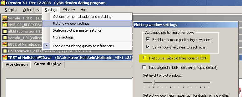
| The default way of plotting in CDendro was previously with late time to the left and older times towards right. This is not the conventional way of presenting the time scale. If you need a curve plotted the conventional way, you may uncheck the "Plot curves with old times towards right" checkbox as shown above. |
|
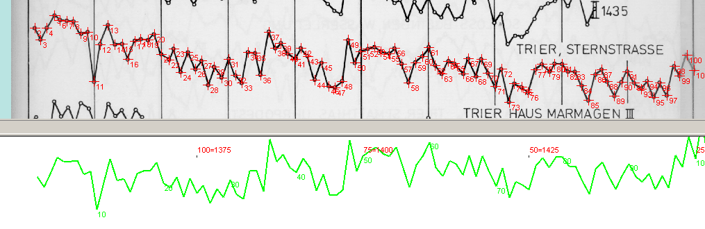
With a suitable setting of some other display options you can get a curve which matches e.g. an old published curve, as shown above with a curve of Ernst Hollstein.
This way you can check your reading-in of a printed curve as above or create a suitable curve for a lecture.
You should be aware that CDendro is not basically written to handle the curves plotted this way. E.g. intervals are always specified with late time first (leftmost value) and old time next (rightmost value). See e.g. the "Look at blocks..." frame on a "Curve display" window. |
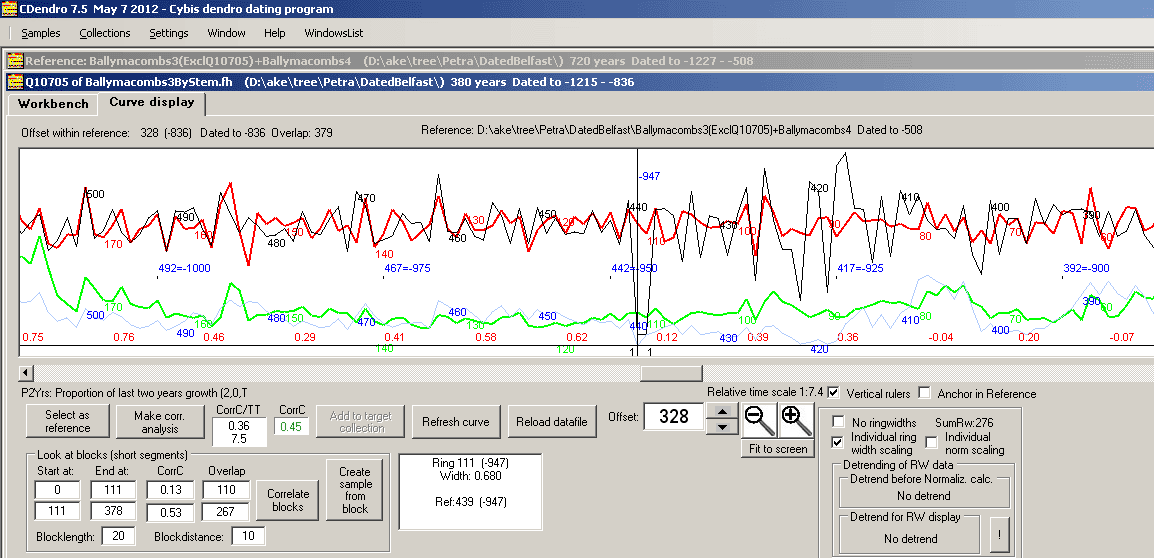
- The stroke weight (thickness) of the red curve can be adjusted through the menu command Settings/Plotting window settings/Red curve stroke weight.
|
To make curve diagrams easier to see, the stroke weight (curve line thickness) of the sample curves can now be made wider than only one pixel as set before. The setting can be adjusted through the menu command "Settings/Plotting window settings/Red curve stroke weight". The red and green curve lines above are two pixels wide. |
|
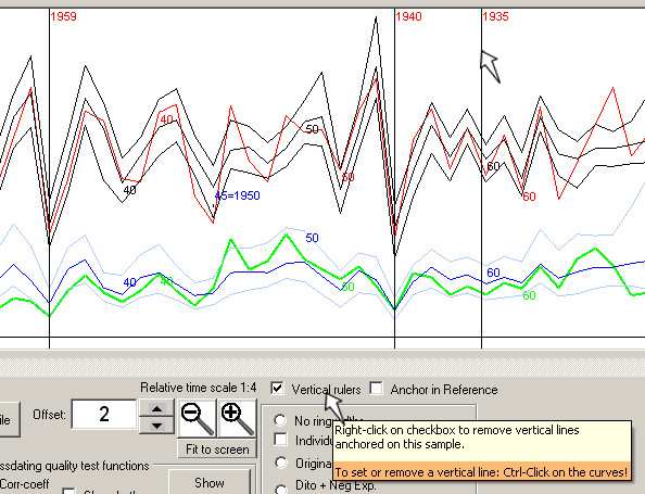
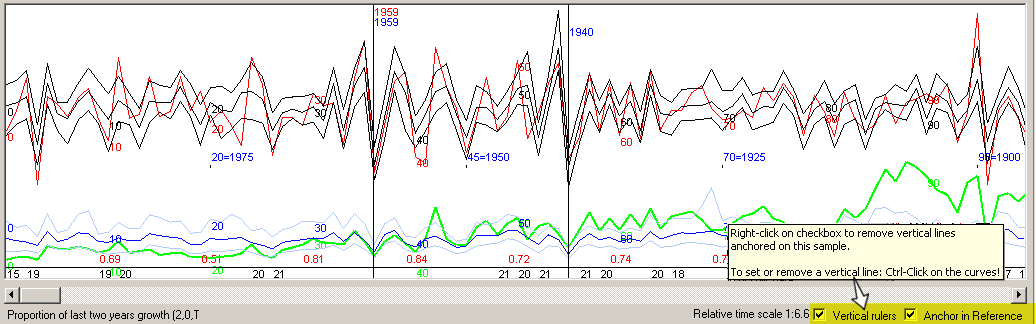
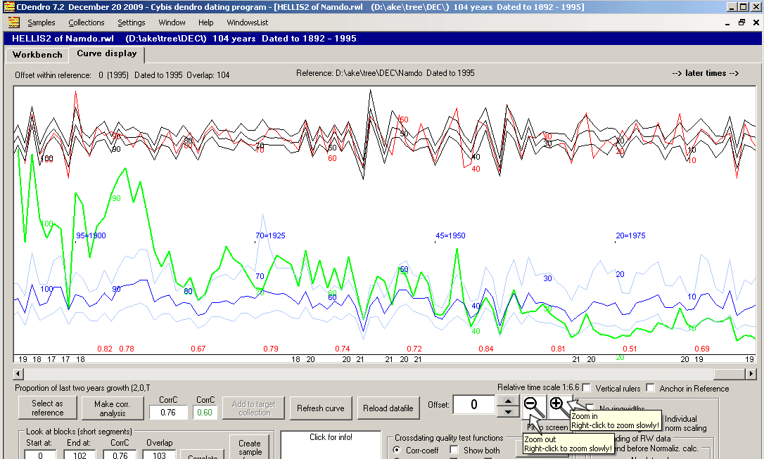
When the "Vertical rulers" checkbox is checked a vertical ruler will follow your cursor along the curve diagram (see ruler marked 1935 above). Use ctrl-click to set (anchor) a vertical ruler across your curves (marked 1940 and 1959 above). The rulers are by default anchored in the current sample. When the "Anchor in reference" checkbox is checked, the ruler will be anchored in the reference.
You will see the difference between the anchoring modes when you shift your current curve in relation to the reference.
To remove a ruler, ctrl-click on it!
|
|
Vertical rulers checkbox now automatically checked when a sample opens and the reference sample already has vertical rulers visible. Also when you check "anchor in reference", the Vertical rulers checkbox is automatically checked. |
|
This feature can be deselected by unchecking Settings/Plotting window settings/Show number of stems behind your collection mean value curve. |
|
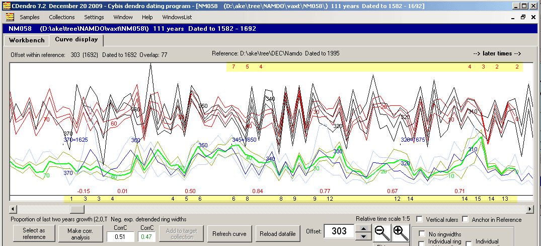
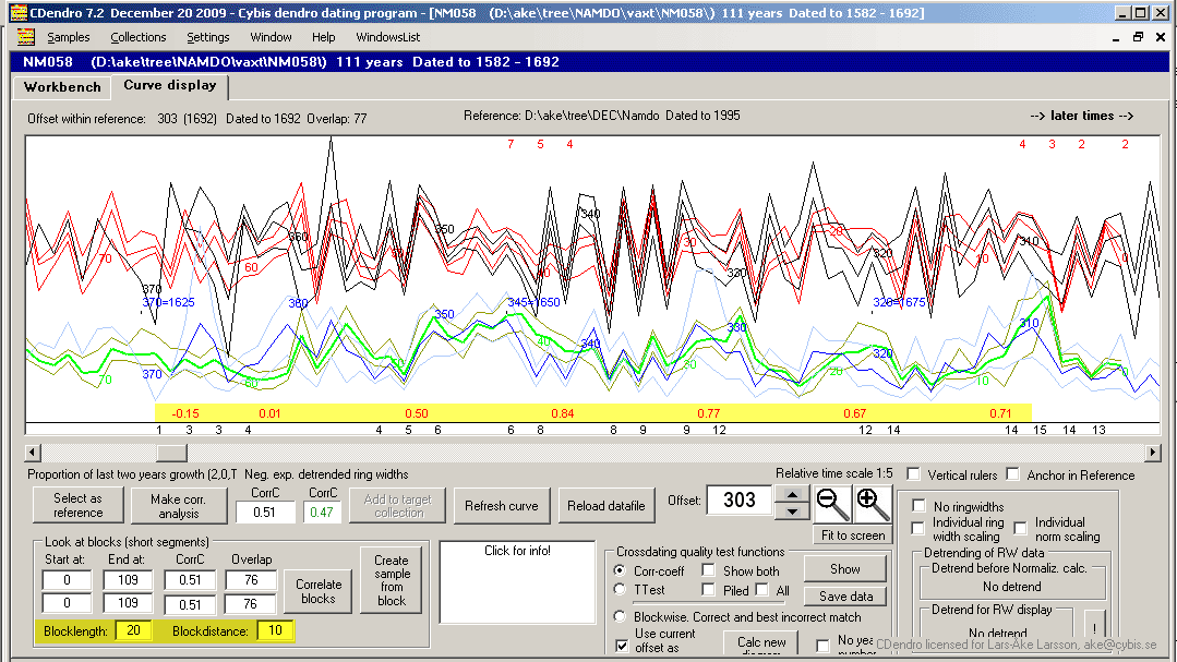
Block length and distance can be set through the text boxes at the lower left corner below the diagrams. Blocks may overlap. |
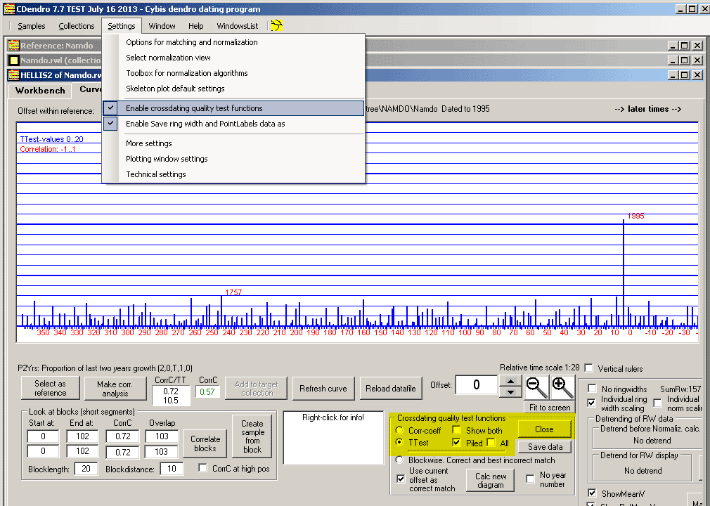
CC and TT calculations to support your visual crossdating
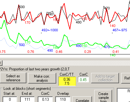
Also the TT-value is now displayed with the CorrC value!
|
Horizontal curve scale can be adjusted in small steps by clicking the zoomin and zoomout icons (magnifier glass) with the RIGHT-button of the mouse. This is useful when comparing with a published curve shown in another application window when each window do not fill the whole screen, but they can be seen simultaneously. |
- "Same-Trend bar" based on Gleichläufigkeit between reference and a sample can be plotted along the green ring width curve.
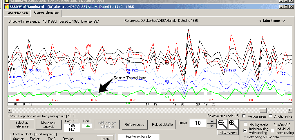
| There is now a "Same Trend-bar" available for those who want to see how the trend (Gleichläufigkeit) varies along two curves being compared. The Same Trend bar can be turned on or off through a checkbox under the curves diagram. The default setting (same-trend or no same-trend bar) can be controlled by the checkbox Settings/Plotting window settings/Show same trend by default. |
|
Click in the curve diagram to get ring width information about that year displayed in the big white box below the curves.
|
|
Crossdating quality test functions
The correlation coefficient (or T-value) for all possible crossdating positions can be plotted as a curve or as a piled (narrow columns) diagram, see above.
Note: The Crossdating quality test functions frame/order panel then has to be enabled through Settings/Enable crossdating quality test functions. |